Jun 9, 2015

Renting in NYC - Am I Paying a Fair Price?

My fellow New Yorkers know that finding an apartment in NYC is one of the more hellacious tasks in life.  If it's not the broker demanding a small ransom for 'finding you a great apartment', it's being disappointed to learn that most apartment looks nothing like their pictures.  Across the board, there's plenty of opportunity to improve the experience.

One area I've tackled is gaining insight into rental prices: specifically, is your monthly rental price above or below the market average for your apartment type?  'Apartment type' is the key word here because, unfortunately, websites offering 'insight' into prices are not very useful, as they tend to either lump all apartments together (regardless of bedroom quantity), skewing the average rental price, or are not granular enough to gain any insight about your specific apartment type; two website examples are here and here.

Predict What You Should be Paying for Rent
Ideally, you should be able enter your current/potential apartment's characteristics (neighborhood, number of bedrooms, quantity of amenities, etc.) into a model that returns the average rental price for that specific type of apartment.  This could be very useful for a couple of scenarios, such as:
  • Scenario #1: If you're about to sign a lease for a new apartment but are uncertain if the price is fair
  • Scenario #2: If you want to know how much apartment you can rent with your available budget
Below is an interact model to help with these scenarios.  I used data on ~13,000 apartment lists from reliable online sources to build the model.  Let me explain how to use it with these simple instructions:
  1. In the first window below, scroll to the neighborhood your current / potential apartment resides in, and take note of it's 'Neighborhood Group' (for example, I live in the Upper West Side, which is in Group #6).  Neighborhoods are grouped together by similar rental prices.
  2. In the second window, scroll through the list and determine the total number of amenities your current / potential apartment has (for example, if your apartment has Central Air Conditioning, a Dishwasher, and an Elevator and nothing else on the list, the apartment has a total of 3 amenities).
  3. Use the information you gathered from steps #1 and #2 (along with the other info you already know about the apartment in question) to walk through the interactive colored diagram below called a 'treemap'.  Do this by clicking on the group that your apartment falls within until you cannot click anymore.  Once unable to click anymore, hover your mouse over the group your apartment falls within and the average rental price for your apartment type will appear.
Steps #1 & #2 - Neighborhood and Amenities Selection:
 

Steps #3 - Apartment Rental Prices 'Treemap':


Pretty nifty, right?  Hopefully you're getting your money's worth!  This model can help you with both scenarios described above; let me know if the model is accurate for your apartment type!  If you want to re-use the treemap diagram, simply refresh the page.


______
Python (scikit-learn) and SAS Enterprise Miner were used for this analysis; code is available upon request

Jan 24, 2015

Avoid Car Accidents in NYC

With all of the driving I do in the city, I wondered how I can improve my odds of avoiding accidents, everything from small collisions to serious accidents, and safely reach my destination.  If you are in the same boat (even if you take taxis on a regular basis), you may be interested in this post.  

Using data from NY's Open Data website, I analyzed all reported motor vehicle collisions in NYC during 2014.  Because time and location data (in the form of longitude/latitude coordinates) was available for each accident, I was able to create a series to diagrams and heat maps to help answer the core questions of avoiding vehicle accidents, specifically: (1) what areas should you avoid while driving, and (2) what times of day should you avoid while driving?  There were about 173,000 reported vehicle collisions in NYC last year, let's see what the data reveals.

Where to not Drive
To start, below is heat map of those 173,000 collisions in NYC (we'll zoom in on specific areas in a moment).  The green areas have few collisions, the red areas have many collisions (over 50 a year).  Coming as no surprise, Manhattan's midtown area has the highest concentration of accidents.  However, you can also see that major highways in Brooklyn and Queens sustain regular accidents (again, not a surprise).

Heat Map of Vehicle Collisions in NYC, 2014 (Red = Highest Concentration of Collisions)

If we zoom in on Manhattan and the surrounding borough areas, we have the below heat map.  I have indicated areas where accidents are most prevalent. 


Midtown Manhattan (running from ~34th St to ~59th St) is not only the busiest area of NYC, it also is fraught with construction, so it's no surprise accidents are heavily concentrated here.  Delancy Street and Canal Street are the major roads leading to major bridges, namely the Williamsburg Bridge and Manhattan Bridge.  In addition, heading west, Canal St. is the major throughfare to the Holland Tunnel to NJ.  These two roads have to accommodate a lot of traffic as a result.  Rounding out the accident-prone areas of NYC is the Barclay's center in Brooklyn, at the intersections of two major roads: Atlantic Avenue and Flatbush Avenue.  It might be hard to avoid these areas due to their centrality but we'll also discuss how timing plays a role when driving.

The Worst Place to Drive
Is there a specific area in NYC that has the highest concentration of collisions per year?  In fact, there is.  It is in midtown Manhattan (east side), and it's where the Queensboro Bridge enters the city at 60th Street & 2nd Avenue.  This areas sustains over 275 collisions a year!  That's about one collision every 32hrs.  Craziness.  Is there something about this bridge and 2nd Ave that leads to this staggering statistic?  I think so.  Check out how the bridge enters the city: it essentially comes to a T-intersection with 2nd Ave and the surrounding side streets.  Imagine trying to navigate this:


No thanks.  Adding to the mayhem, the trolley tram from Manhattan to Roosevelt Island is located in the immediate vicinity, with lots of associated pedestrian foot traffic.

And that T-intersection I was talking about?  Here's a street view of the area.  As you can see, approaching from the bridge, if you inch out even a little bit on 2nd Ave, you're going to be hit.


The Queensboro Bridge is also a heavily used bridge because there's no toll for crossing it, which probably adds to the concentration of accidents in this area.

When to Not Drive
Avoiding the above-mentioned 'hot spots' makes sense but this recommendation probably doesn't need to be heeded all day.  What are the best / worst times to drive in NYC?  Using the same data set mentioned above, I created the following histogram, which shows how many collisions occurred in 2014 at different times of day.


Not surprising, most collisions occur during rush hour - but using the above chart as a proxy, rush 'hour' happens to be a rush day, occurring from ~8:00AM to ~7:00PM when accidents are at daily highs.  Ouch.  To decrease your chances of collision, you'll have to leave / enter NYC before 8:00AM, or after 7:00PM.  That kind of sucks but at least you know when your chances of being in a collision increase / decrease.

There are also a few interesting side-notes worth mentioning about the above histogram:

  1. You can see there is a slight up-tick in accidents in the early hours (around midnight to 2:00AM).  This is likely due to party-goers driving themselves home or taking a taxi home.
  2. You'll notice a very sharp decrease in the number of collisions in the middle of rush hour (around 4:00PM)!  My guess for this nearly 3,000 accident daily drop occurs because of taxi shift changes.  In NYC, taxis are driven by two drivers, each on duty for a 12hr shift.  To make each driver's shift equally attractive, the high demand time of day is split between the two people, the split occurring at peak demand time.  Unfortunately, the first driver has to hand off the taxi to the second driver in Queens (where most taxi depots are located), resulting in a massive taxi decrease in the city.  This NY Times article explains this further.

Driving on The Weekends
Breaking down collisions by day of the week, we obtain the below histogram (which is a little hard to read at first):


You can see two interesting things:

  1. Saturday and Sunday experience about 30% fewer collisions than any other weekday
  2. (Likely) due to Saturday night party goers, late-night collisions peak late Saturday / early Sunday (i.e. at least double the number of collisions in comparison to any other weekday).

Recommendations
Using the above heat maps and historgrams, you should:

  1. Avoid Midtown (especially the Queensboro Bridge) and Lower Manhattan (Delancey / Canal St.) by using other entries into the city, or (even better) by using the subway
  2. If you have to drive into / out of the city via the 'hot spots' do so before 8:00AM or after 7:00PM to lower your chances of accident
  3. Drive into / out of the city at any time during the weekends (but be aware of driving late at night: there are more collisions at this time, and you'll likely be tired as well)

Other than these recommendations, using the data, we can also conclude that the number of accidents increases as there are more vehicles on the road.  However, with the help of some informative data analysis, maybe we can break this trend.  Drive safely!

______
SAS was used for this analysis; code is available upon request
heatmaps generated using QGIS
Source of data from NY's Open Data website 

Jan 11, 2015

All of NYC's Farmers Market Locations

Fresh veggies, spices, cheeses, beers, soaps - the litany of products available at NYC's farmers markets is impressive!  If you're a fellow New Yorker, you've probably gone to at least one market.  But I'm also sure you've overlooked or missed at least one because you weren't aware of its location or season of operation.  Why not make a map showing all of NYC's farmers market locations?  That could be useful.

I made the below map from NY State's Open Data initiative.  From the state's website, anyone can download data sets on publicly available information; in this case, the location of every NYC farmers market.

All of the market locations have been color coded to indicate when they're running (Summer, Multiple Seasons, Year-Round), and you can filter the map to highlight only those markets that fit a Season criteria of your choice.  Click a market icon, and you'll see the name, operating hours and days, and the website of the farmers market.  If you want to view the map in full screen, click the link at the bottom-left of the map.


There's probably a farmers market closer to you than you think; take a look!


View NYC Farmers' Markets in a full screen map


If you don't see a market on the map that you definitely know is there (remember, Smorgasburg in Williamsburg, Brooklyn technically doesn't count) let me know and I'll inform the state to update their database!


______
Excel used for categorizing markets
Map produced using BatchGeo
Raw data from Data.ny.gov

Jan 8, 2015

When & How Should you Play the PowerBall Lottery?

Do you play the PowerBall lottery on a consistent basis?  Why not improve your odds of making money by following some simple principles about when and how you should play PowerBall.

If you're unfamiliar with PowerBall, here's a quick run-down on how to play and your odds of winning.  Every Wednesday and Saturday, 5 white balls are selected at random from a group of 59, and a single red PowerBall is selected from a group of 35.  To win the jackpot (which is always a minimum of $40,000,000), you have to match the 5 white balls and the 1 red PowerBall.  However, in addition to the jackpot, there are eight other ways to win, each with a different cash winning and chance (odds) of winning; here are the ways to win:


powerball.com
To play, each ticket costs you $2.  There is a 'multiplier' option with your ticket that costs an additional $1, and it works like this: all winnings (except for the jackpot) are multiplied by a number (2 through 5) chosen by a computer prior to the drawing of balls (note that the higher numbers are selected less often by the computer).  The winning with the multiplier are as follows:


powerball.com

Great, you know how to play - but should you?
To help us answer this question, we first need to think of your ticket purchase as an investment, and the drawing outcome as either your profit or loss.  In the simplest case, you make an investment of $2 and hope for a profit.  If you win, you profit is the winnings minus the ticket cost (e.g. $1,000,000 - $2 = $999,998).

We know the odds of each type of win, and the respective payout for each (we'll assume NO multiplier for now).  With this information, we can calculate your ticket's expected value.  Expected value is the average profit (or loss) you expect to make if you play on a continual basis.  If you play only once, your ticket will either be worth $0 (no win) or greater than $0 (you won something), obviously NOT the average.  However, if you consistently play, you will win some times and lose other times, and you'll have an average profit (or loss) depending on your tickets' performances.  This average profit/loss is expected value.  If we assume a jackpot size of $40,000,000 (the minimum), you have the following expected value for your ticket:


The above table tells us that by consistently buying $2 tickets, you can expect a loss in the long run, if the jackpot is $40,000,000.  Put another way, for each ticket you buy, your investment of $2 will, on average, reap a $1.41 loss.  Not good.  You might as well put that money towards paying your NYC rent.

But we also know that the jackpot size increases over time if there are no winners.  So there must be some jackpot size that is large enough to make the investment break-even.  This is true, and the below graph shows the jackpot size needed to achieve this:


FIGURE #1

The above graph tells us that you shouldn't play PowerBall unless the advertised jackpot size is greater than $290,000,000.  Why?  Because this jackpot is large enough to compensate for the dismal odds of winning, and you'll thus have a positive investment in the long run.

But there's a big catch
What if there are multiple jackpot winners?  If multiple people win a jackpot, the winnings are split across all recipients.  This outcome would significantly reduce your ticket's value.  We have to include the probability of more than one jackpot winner within the expected value calculations made above.  To do this, we leverage what are called Bernoulli trials.  In a nutshell, Bernoulli trials calculate the probability of N number of successes with X number of attempts in a particular scenario.  The scenario is winning the jackpot, the number of success is 'greater than 1 winner' and the number of attempts (i.e. trials) is the number of purchased tickets.  The following graph, created using the equation for Bernoulli trials, shows the probability of 0 winners, 1 winner and 'more than 1 winner' as the number of participants increases:


If the graph is complicated, don't worry about it.  The take away is that the probability of more than one winner increases as more lottery tickets are sold (intuitive, right?) but this, unfortunately, decreases your ticket's expected value.  How much does this change your ticket's expected value?  In other words, how will this change Figure #1 above?  To answer this question, we need to know how many people will participate in the lottery at different jackpot sizes.  Luckily for us, there is a strong correlation between the jackpot size and the number of tickets sold.  The below graph (built from two years of historical PowerBall data) clearly shows this correlation: as the jackpot increases in size, more people are struck with lottery fever, and more tickets are sold.  Note I have also placed a regression model line on top of the data, and it will be used to estimate the number of players based upon the jackpot size.


lottoreport.com

Now we have everything needed to update Figure #1 and thus better understand your ticket's expected value with the probability of multiple jackpot winners.  The below chart is the updated version of Figure #1, and it incorporates everything we've learned thus far (odds of you winning, ticket expected value, and probability of other players winning).  As you can see, the below chart has an interesting shape: your ticket's expected value is positive for a certain range and then becomes negative again.  Specifically, your ticket's expected value is positive if the jackpot size is between the values of $300,000,000 and $570,000,000:


FIGURE #2

This means that if you play on a consistent basis ONLY when the jackpot is between $300 and $570MM, you will have, on average, a positive return.  Put another way, for every $2 you spend to purchase a PowerBall ticket, you can expect up to a $0.50/ticket return on your investment.

Cash-Out & Multiplier Options
To be clear, everything we've covered thus far assumes a regular $2 ticket (with no multiplier option at $1 extra per ticket) and the Annuity Option if you win the jackpot.  The annuity option means you win the advertised jackpot amount and are paid it over the course of 30 years (one payment a year).  However, most people choose the 'cash-out' option, meaning the jackpot winnings are immediately paid-out; the consequence is that the cash-out amount is significantly reduced in comparison to the advertised / annuity amount.  I looked at all the winning amounts for the past several years and, on average, the amount is reduced by factor of 1.85.  For example, your $40,000,000 annuity winning would be reduced to approximately $21,620,000 if you opted for the cash-out option.

Now figure #2 above can be updated with the expected value of your ticket under two new scenarios: (1) if you choose the cash-out option, and (2) if you choose the multiplier options (note, I have assumed the best multiplier option of 5).  The results are as follows in Figure #3 below.  As you can see, in the long run, the cash-out option as well as the multiplier option (even in the best case scenario) do NOT result in positive investments:


FIGURE #3

Recommendations
Your chances of winning are the same for every ticket you purchase (and the odds are dismally small, let's just be honest with ourselves) but if you consistently buy PowerBall tickets, you might as well improve your return on investment buy following these recommendations:

  • Purchase tickets only when the advertised jackpot is between $300 and $570MM
  • Purchase only the regular $2 ticket without the multiplier option
  • Choose the annuity option for collecting your jackpot winnings

Best of luck!

______
Excel was used for this analysis; spreadsheets available upon request
Source of data and pictures from Powerball:
http://www.powerball.com/powerball/pb_stories.asp
http://www.powerball.com/powerball/pb_prizes.asp

Dec 9, 2014

Escape NY! - How to Fly Out of NYC (Part 2)

In a previous post I discussed the best times of day to leave from NYC airports to avoid delay.  However, correctly timing one's escape from NY is only part of the battle - the other half is choosing the right airline to make the escape.  In this post, I identify the airlines with the best performance in terms of smallest chance of being delayed.  In addition, in the event you have to leave during a time with high delay potential, I'll also discuss how long you may be postponed, so you can set your expectations (and can decide if you should buy additional reading material).

Expected Wait Time If Delayed
I'll first start with discussing how long you may be postponed in the event your plane is delayed.  As discussed previously, we are now cognizant of the times of day when JFK, LaGuardia, and Newark experience increased delays (see original chart on this topic).  But this is useful only when you can choose your departure time.  What if you travel for work, and the soonest you can leave NYC is on an evening flight (when delay potential is highest), how long will you be waiting on the tarmac?  First, let's look at how long delayed flights wait before departing from each NYC airport.  The below charts show the range of delay for each airport; the x-axis shows the amount of delay (in minutes) and the y-axis shows the percent of flights that experience that particular amount of delay.


As you can see, in addition to being very similar, the graphs (called histograms) start high and quickly decrease.  This means most delayed flights have a shorter wait time and a few outlier flights have very long delays (some are over 6hrs).  You can find the average of all delays (~61 minutes for each airport) but your calculation would be misleading, it would be too high.  Why?  Look at the shape of each histogram - they are significantly skewed to the right.  Because they are not symmetrical (like the 'classic' bell curve / normal distribution curve) the average is skewed - in this case skewed to the right (i.e. higher).  The outliers far to the right are responsible for this misleading average calculation.  A better measure of delay in this case is the median.  The median is found by lining up all delay times from smallest to largest and selecting the middle value.  Because of how it is calculated, the median is much less prone to being skewed than the average.  For all airports, the median delay time is ~40mins.  Here are the histograms again with the median and averages placed on top:


So, expect to wait about 40 mins if your flight is delayed, regardless of airport, right?  Almost.  Rarely (if ever) can performance be summarized by a single number.  In reality, there is a performance range.  For example, the percent chance a flight is delayed less than 20 mins, less than 30 mins, more than 60 mins, etc.  You get the idea.  Using the above histogram data the following table was produced; it shows different delay times by airport and their associated percent chance of occurrence.


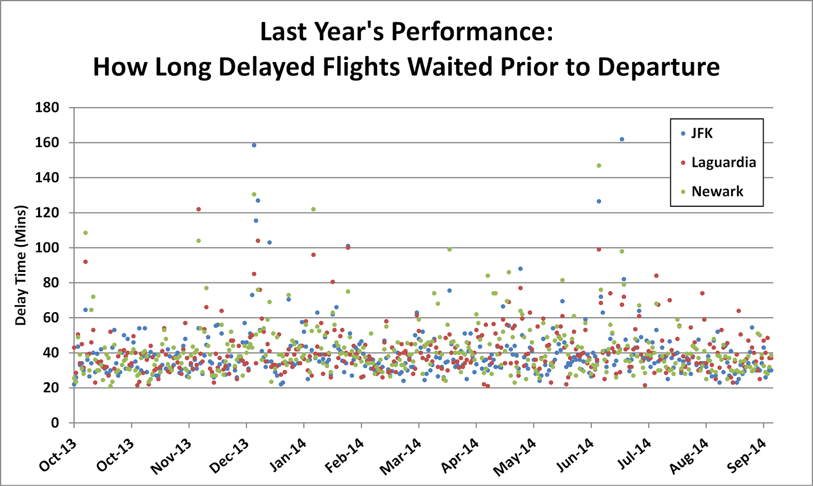
This table helps us understand the range of potential delay.  For example, across all airports, there's a 10% chance your wait will be less than 18 mins (so be ready to sit around for longer).  In the converse, it's nice to know there's only a 10% chance your wait will be greater than 2.0 hrs.  If I had to make a recommendation to set expectations, I would use the middle range (called the interquartile range) of ~25 min to ~77 min.  In plain English, this means the following: if you're delayed, you should expect to wait ~25 mins to ~80 mins before you actually take off.  This range holds true for almost the entire year, which you can see with the below scatter plot.  Notice how almost all delays fall within the 25-80 min range:


Best Airlines To Escape NY
Now your expectations have been set in terms of delay.  But your goal in the first place was to avoid delay!  You know when to leave NY, but which airline should you select?  All of the previously discussed concepts about wait times and percent delayed flights can be applied to each airline carrier.  Crunching the numbers, the following table is produced, which shows the performance of each airline flying out of JFK, LaGuardia and Newark; the carriers are ranked by number of flights per year.  As you can see, American Airlines, US Airways, and Virgin America have the best performance stats out of all carriers.


Ranking the top three carriers, I would give:
  1. 1st place to US Airways,
  2. 2nd place to Virgin America, and
  3. 3rd place to American Airlines.
These rankings focus on departure delay, percent delayed flights, and number of flights per year.  I would rank Virgin as #1 but their limited reach and lower number of flights (~5,500 / year) across America means you might not find a flight to your destination.  US Airways tends to be ranked lower by national surveys because of less-than-stellar customer satisfaction scores (typically about 'mishandled baggage') but their strong on-time performance coupled with their reach across America (nearly 20,000 flights / year) makes them my #1 (as a side note, you can avoid 'mishandled baggage' by bringing only a carry-on with you; I do this even for my international flights).  American Airlines makes the cut at #3 by default: if you can't find a flight on US Airways or Virgin, you should choose the next best performing carrier.  Note I purposefully haven't included high-performing airlines like Hawaiian Airlines and SkyWest in my top 3 because they don't have enough flights out of NYC (only 310 and 168 flights a year).

In the converse, avoid ExpressJet Airlines if at all possible.  They had the worst on-time performance out of the entire group.

In Summary, (1) use the departure chart to figure out the best day and time to leave from your desired airport; (2) choose one of the top-three performing airlines listed above; and (3) be prepared to wait ~25 min to ~80 mins if you are in fact delayed.

And there you have it.  Now go escape NY!
______
SAS was used for this analysis; code is available upon request
Source of data from RITA (Research and Innovative Technology Administration - Bureau of Transportation Statistics)
Time range of flight data: 10/1/2013 to 10/1/2014

Nov 21, 2014

Escape NY! - How to Fly Out of NYC

We all know how terrible flying out of NYC can be with the high potential for delays. Combined, the major airports (JFK, LaGuardia, and Newark) are responsible for ~315,000 departing flights per year, and any New Yorker can tell you at least one horror story involving a delay.  So, how can you avoid being on one of those flights?  Do you choose JFK, LaGuardia, or Newark?  And on which day and at what time should you leave?

There are some who would suggest you avoid delays by simply choosing the most conveniently located airport and, regardless of the day, leaving as early in the morning as you can stand.  This school of thought is not incorrect (flights departing later in the day do indeed have a greater chance of being delayed - and the data shows this) but it is imprecise.  Do you really need to depart at 6 or 7am?  What is the increased risk of being delayed if you leave just a little bit later at 8 or 9am?  A more precise method for choosing a departing airport, day and time to minimize delay needs to be created.  This is what I have attempted to do with the chart below.

Departure Delay Chart (And How To Read It!):
The first thing you'll notice about the below chart is the color; just ignore that for a second.  The left-hand column shows the weekdays, and under each weekday are listed the three NYC airports.  The other columns show the time of day of departure, in one-hour increments.  The percentages in each cell represent how many flights were delayed out of the total.  For example: flying out of JFK on a Sunday between 6-7am typically results in only 7% of flights being delayed, not bad.  However, 29% of flights were delayed that flew out of JFK on a Sunday between 6-7pm; not so good.  The colors (green, yellow, red) are used to highlight low, medium, and high levels of delay.  It makes sense to avoid the yellow and red time slots to better avoid delay.


The chart was assembled using 12 months of historical data on each airport (the mentioned ~315,000 flights), so we can have confidence in the displayed percentages.

The chart is pretty useful for planning your next trip.  If you're trying to start your long weekend and fly out of NYC on a Friday, leaving very early from any airport could work but the chart suggests you have a better option: sleep in later and depart from JFK no later than around noon.  Your potential for delay is still minimal (~15%), even at the later time. Now you can have your cake and eat it too.  There are many other scenarios you can optimize with the aid of the chart.

Taking it One Step Further:
What if you can't help but leave during a yellow or red time slot, how long should you expect to be delayed?  And quite frankly, is there actually a correlation between percentage of delayed flights and average delay time?  I'll be answering these questions in my next blog post; stay tuned!


------
SAS was used for this analysis; code is available upon request
Source of data from RITA (Research and Innovative Technology Administration - Bureau of Transportation Statistics)
Time range of flight data: 10/1/2013 to 10/1/2014